HEADING 1
Heading 2
Heading 3
Heading 4
Heading 5
Heading 6
General Body Copy
Maecenas pulvinar ut velit vel tristique. Phasellus lacinia felis neque, sed bibendum felis lacinia nec. Suspendisse consequat lorem nisi, lacinia tincidunt eros efficitur eu. Etiam vel diam lectus. Nullam nec turpis in justo faucibus pellentesque in non sem. Pellentesque urna enim, hendrerit sed varius non, volutpat sed leo. Morbi aliquam velit at quam bibendum iaculis vel et purus. Nulla placerat nibh turpis, a maximus libero ullamcorper fermentum. Vivamus ut venenatis mauris. Nam lacinia eleifend dui vitae varius. Suspendisse gravida urna quis elit aliquet aliquam. Nulla pellentesque odio in urna egestas tempor. Donec ut semper lacus, a sagittis tellus.
Nulla facilisi. Phasellus neque dui, finibus ac libero et, molestie suscipit urna. Vivamus auctor tristique risus, ut eleifend urna aliquet sit amet. Praesent ultricies vestibulum justo, pretium dictum mi mollis in. Sed lectus metus, mattis in ullamcorper sit amet, vehicula et sapien. Mauris id nunc ornare, sollicitudin felis ut, rhoncus lectus. Curabitur vulputate mi a arcu fermentum, vitae pulvinar risus elementum.
Duis ut viverra nisl. Morbi sagittis tincidunt finibus. Vestibulum scelerisque luctus diam, eu dictum erat posuere nec. Vivamus non leo gravida, pharetra purus in, porta odio. Proin non dictum nulla, vitae finibus tortor. Maecenas ultricies eros sapien, dictum convallis quam consectetur sit amet. Pellentesque lacus velit, ullamcorper quis lectus eu, aliquam cursus purus. Donec pharetra sem lorem, ac luctus nulla eleifend non.
Color Classes
The site uses a number of classes that are useful for changing background colors, foreground colors, hover colors, etc. You can use these class names in the "Button" shortcode with the "class=xx" attribute, or anywhere you need to input custom HTML. The general format of all of these class names is as follows:
[colorcode][hover (optional)]
Color 1, Color 2, Black, White, and other colors are all controlled via Settings -> Theme Options -> Colors.
Foreground Colors
fg-c1 Change the foreground of the element to Color 1
fg-c2 Change the foreground of the element to Color 2
fg-body Change the foreground of the element to the Body Color
fg-white Change the foreground of the element to the theme White color
fg-black Change the foreground of the element to the theme Black color
Foreground Colors - Hover
fg-c1-hover Change the foreground of the element to Color 1 on hover
fg-c2-hover Change the foreground of the element to Color 2 on hover
fg-body-hover Change the foreground of the element to Theme Body Color on hover
fg-white-hover Change the foreground of the element to Theme White Color on hover
fg-black-hover Change the foreground of the element to Theme Black Color on hover
Background Colors
bg-c1 Change the background of the element to Color 1
bg-c2 Change the background of the element to Color 2
bg-body Change the background of the element to Body Color
bg-white Change the background of the element to Theme White
bg-black Change the background of the element to Theme Black
Background Color and Opacities
bg-c1-opacity Change the background of the element to Color 1, partially transparent
bg-c2-opacity Change the background of the element to Color 2, partially transparent
bg-white-opacity Change the background of the element to Theme White, partially transparent
bg-black-opacity Change the background of the element to Theme Black, partially transparent
Background Color and Opacities - Hover
bg-c1-opacity-hover Change the background of the element to Color 1, partially transparent on hover
bg-c2-opacity-hover Change the background of the element to Color 2, partially transparent on hover
bg-white-opacity-hover Change the background of the element to Theme White, partially transparent on hover
bg-black-opacity-hover Change the background of the element to Theme Black, partially transparent on hover
Background Colors - Hover
bg-c1-hover Change the background of the element to Color 1 on hover
bg-c2-hover Change the background of the element to Color 2 on hover
bg-white-hover Change the background of the element to Theme White on hover
bg-black-hover Change the background of the element to Theme White on hover
Border Colors
border-c1 Add a border to the element with color set to Color 1
border-c2 Add a border to the element with color set to Color 2
border-white Add a border to the element with color set to Theme White
border-black Add a border to the element with color set to Theme Black
Single Borders
border-top-c1 Add a border to the element with color set to Color 1 at the top
border-top-c2 Add a border to the element with color set to Color 2 at the top
border-top-white Add a border to the element with color set to Theme White at the top
border-top-black Add a border to the element with color set to Theme Black at the top
border-left-c1 Add a border to the element with color set to Color 1 at the left
border-left-c2 Add a border to the element with color set to Color 2 at the left
border-left-white Add a border to the element with color set to Theme White at the left
border-left-black Add a border to the element with color set to Theme Black at the left
border-right-c1 Add a border to the element with color set to Color 1 at the right
border-right-c2 Add a border to the element with color set to Color 2 at the right
border-right-white Add a border to the element with color set to Theme White at the right
border-right-black Add a border to the element with color set to Theme Black at the right
border-bottom-c1 Add a border to the element with color set to Color 1 at the bottom
border-bottom-c2 Add a border to the element with color set to Color 2 at the bottom
border-bottom-white Add a border to the element with color set to Theme White at the bottom
border-bottom-black Add a border to the element with color set to Theme Black at the bottom
Border Colors: hover
border-c1-hover Add a border to the element with color set to Color 1 when hovered over
border-c2-hover Add a border to the element with color set to Color 2 when hovered over
border-white-hover Add a border to the element with color set to Theme White when hovered over
border-black-hover Add a border to the element with color set to Theme Black when hovered over
CTAs are now Gutenberg blocks, able to be added to any Gutenberg editor slot. Search for "CTA" or "GCom" and choose the relevant options.
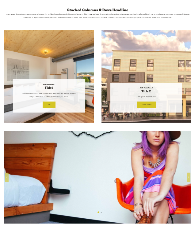
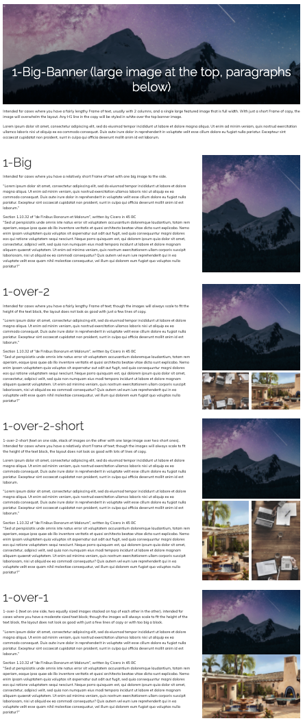
Lorem ipsum dolor sit amet, consectetur adipiscing elit, sed do eiusmod tempor incididunt ut labore et dolore magna aliqua. Ut enim ad minim veniam, quis nostrud exercitation ullamco laboris nisi ut aliquip ex ea commodo consequat.
Duis aute irure dolor in reprehenderit in voluptate velit esse cillum dolore eu fugiat nulla pariatur. Excepteur sint occaecat cupidatat non proident, sunt in culpa qui officia deserunt mollit anim id est laborum.
Bold Italics Bold-Italics
- Bulleted list 1
- Bulleted list 2
- Bulleted list 3
- Numbered list 1
- Numbered list 2
- Numbered list 3
This is a block quote.
GCommerce Modules for this Theme